Igeek
Brief: Brand, Website, print
Url: igeek.co.uk
I named this business back in 2000 or thereabouts, it has rebranded a couple of times since and each time they have come to me. The latest brand was done in 2012.


Brand
Technology companies need to look modern and clean and the calibre of Igeek, as one of the top Filemaker Pro database development firms in the UK, meant that I needed to reposition them subtly. Their previous brand used a futuristic font which I bought in maybe 1998.
For the new brand I tweaked a font called Soho Gothic by an amazing font designer called Seb Lester at the Monotype Corporation.
This work utilised the current flat graphic illustration style to maintain the modern techy look, I designed flyers and banner stands.
Website
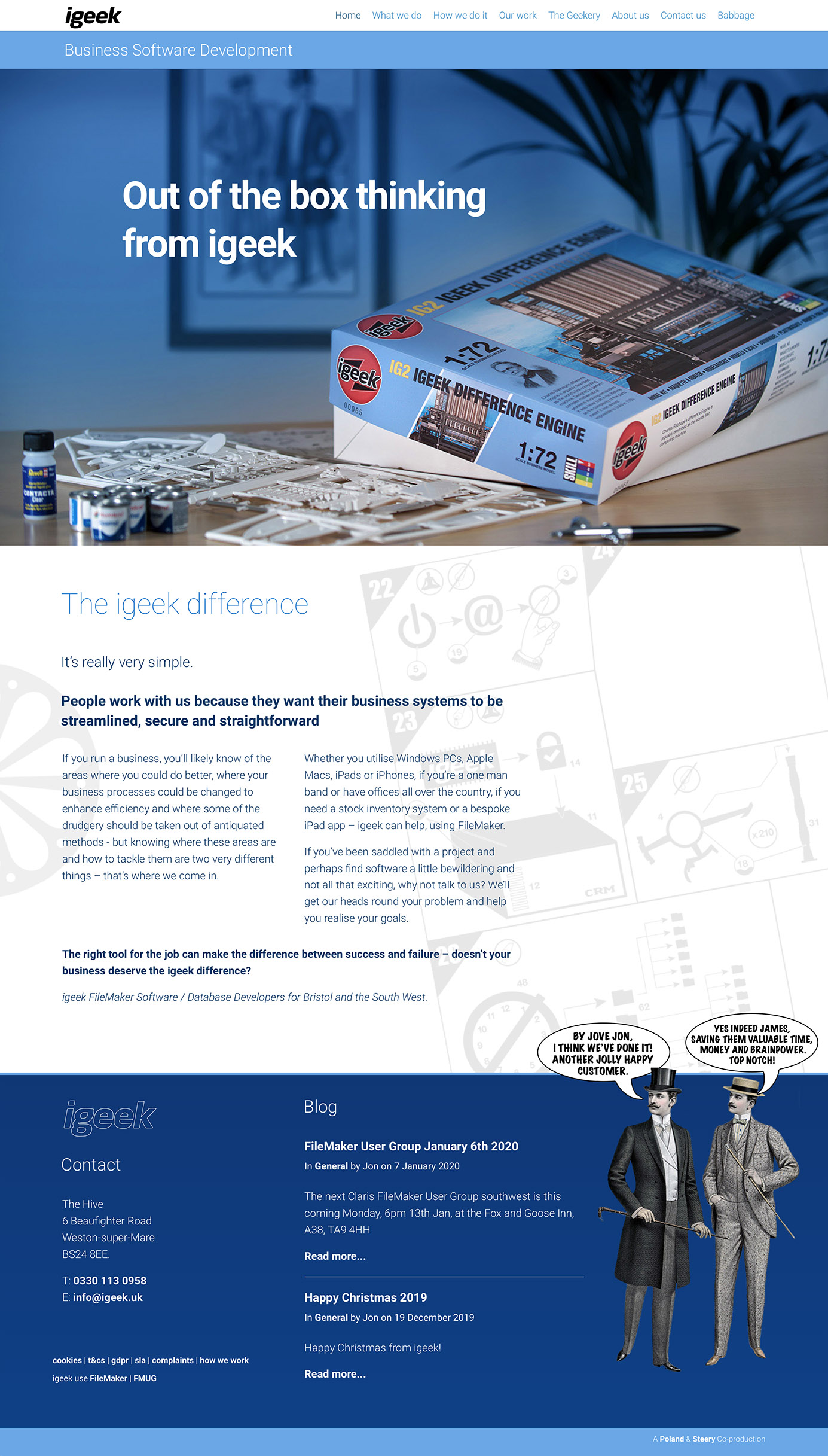
I recently redesigned the igeek site based on the concept of a model kit. The Kit was a spoof of an Airfix kit and it was based on the idea of a Charles Babbage difference engine. The idea being that Babbage is the father of computing and the sprues and instructions allowed for the customer to employ igeek to create software which allowed them to save time and so use that time to perform tasks which are more enjoyable.
I created the box artwork and then photographed it with a few props and ultimately built the site with a little tongue in cheek.
I have redesigned the igeek site three times in the last ten years, firstly at a set width in around 2010 and then as a responsive, mobile first principled design in around 2013. and now this one.